Context
A choropleth map displays the distribution of data across geographic regions, using color-coding. They provide a spatial perspective on important information that is usually challenging to understand. They can display a wide range of data, including population density, income levels, educational attainment, climate patterns, and more. Thus, Choropleth maps can be useful in tracking and managing a country’s efforts towards achieving the UN’s Sustainable Development Goals (SDG).
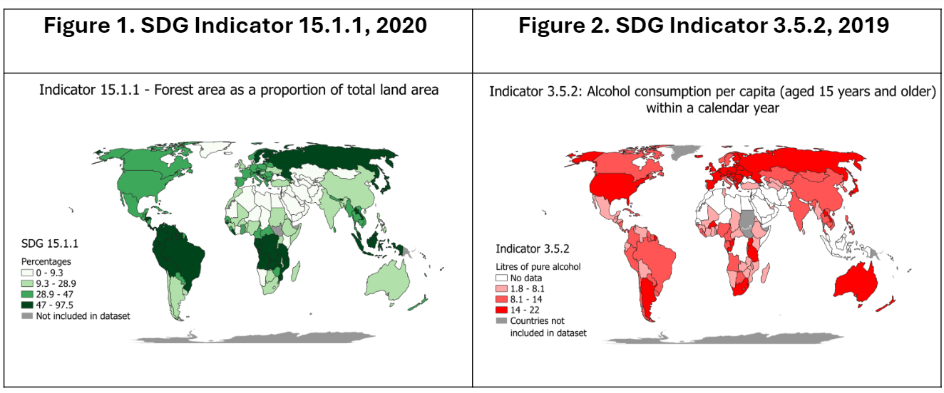
Map Description & Purpose
The following maps were created to measure each country’s progress in SDGs 15 and 3, by representing indicators 15.1.1 and 3.5.2 in the latest years that data was available for. While the first choropleth map represents SGD indicator 15.1.1 (Forest area as a proportion of total land area for the latest year 2020), the second choropleth map displays SDG indicator 3.5.2 (Alcohol consumption per capita (≥15 years age) within a calendar year for the latest year 2019).
For each indicator, the map communicates the value range for that indicator for different countries in their latest years. For instance, for SDG indicator 15.1.1, the choropleth map in Figure 1 shows that Russia, Sweden, Finland, Brazil, Venezuela, Columbia, Ecuador, Peru, Suriname, Guyana and the Democratic Republic of Congo, all shaded in the darkest shade of green, having the highest-class division, informs that forest area makes up over 47% (but less than 97.5%) of the total land area for all these countries. Comparably, for SDG indicator 3.5.2, Russia is shaded in the highest-class value, having between 14 and 22 liters of alcohol consumption per capita per year, shown in Figure 2. All in all, these maps can be useful to guide policy and action necessary for SDGs attainment. Furthermore, inter-year comparisons between a specific SDG can help monitor the effectiveness of an implementation policy/action plan.
Map Making Process
Both Choropleth maps were created on QGIS individually and then combined as a web map. To create the individual Choropleth maps, a common ‘global boundaries’ dataset from Natural Earth, was combined with individual indicator datasets used came from The SDG API, to produce two distinct choropleth maps. In the process, we learnt to observe and filter the attributes table. Lastly, the interactive map was stylized (color schemes, class breaks, pop-ups) on Esri online for the individual indicator maps, that were finally compared using a web app template.